CSS Trivia: Masonry Grid Layout
Pinterest’s layout has always been the defining feature of the site since its inception. It has been used by many others since then, and I’ve always been fascinated by it. Recently, I’ve come to learn that this type of layout is called a Masonry Layout, a name that comes from the craft of stonemasonry. Another thing I’ve learnt recently is that CSS has an experimental masonry grid layout, with very limited browser support. The specifications are outlined in CSS Grid Layout Module Level 3 Editor’s Draft for those who are interested.
500DALL.E’s interpretation of a masonry layout

Creating a Masonry Layout
There are a few different ways to achieve this layout. Horizontal masonry layouts are simpler to create than vertical ones1. You can simply use inline-block elements, or use a flex container with flex-wrap: wrap if you want more control over the layout.
For a vertical layout, flex doesn’t do as well unless you have a fixed height container. An approach I like personally is to use columns2. Column layouts are responsive and allow setting the maximum number of columns. The following CSS creates a column layout with a maximum of 4 columns, each column having the ideal width of 180px, and a gap of 10px between columns3.
#column-layout {
  columns: 4 180px;
  column-gap: 10px;
}
The main issue with this approach is that the order of the child elements in the layout is vertical, not horizontal. The example below shows the above CSS in action. Note the order of the elements.
See the Pen CSS Masonry Grid Demo by Dalia (@irrelevant-space) on CodePen.
Approaches for a CSS Masonry Layout is a great read on the different ways a masonry layout can be achieved. It covers the cases above and more.
Enter Masonry CSS Grids
So far, CSS grid layout hasn’t been flexible enough to create a masonry layout, but this might be about to change. The Editor’s Draft introduces a new masonry value to be used for grid-template-columns and grid-template-rows properties. The snippet below creates a responsive vertical masonry grid with columns having an ideal width of 180px, and a gap of 10px between the elements in the grid.
#masonry-grid {
  display: grid;
  grid-template-columns: repeat(auto-fit, minmax(180px, 1fr));
  grid-template-rows: masonry;
  gap: 10px;
}
The result would look something like this:
masonry-grid.pngCSS Grid with
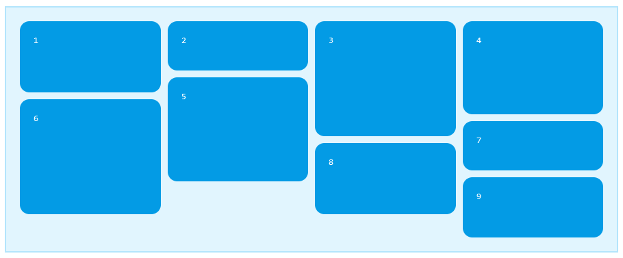
grid-template-rows: masonry
If your browser supports masonry grids, you can see it in action here:
See the Pen CSS Masonry Grid Demo by Dalia (@irrelevant-space) on CodePen.
Examining the result, you’ll notice that the order of the elements is horizontal, but they’re not exactly in order. The masonry layout algorithm places elements in the columns with the most remaining space to try to achieve an even look for all columns4. If order is important, using masonry-auto-flow: next will place the elements in order, but the final result won’t be as even.
masonry-next.pngMasonry Grid with
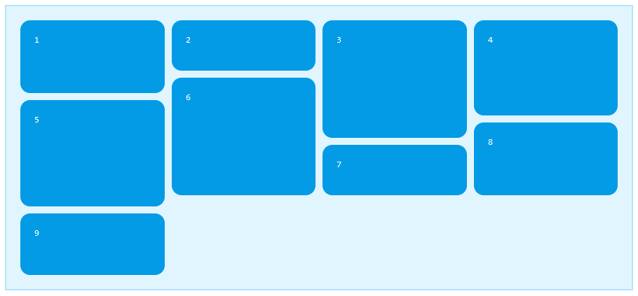
masonry-auto-flow: next
See the Pen CSS Masonry Grid Demo by Dalia (@irrelevant-space) on CodePen.
Browser Support and Fallbacks
As of writing this, the masonry value is only supported in Safari Technology Preview5 and in Firefox6 as an experimental feature. If any of the code samples above didn’t look right, it might be because the browser you’re using doesn’t support it yet. If you really want to use it (I know I do), then make sure to provide a fallback for other browsers.
The default fallback when using masonry in an unsupported browser, is to ignore it and use auto instead. This example shows what the fallback would look like.
See the Pen CSS Auto-Placement Grid Demo by Dalia (@irrelevant-space) on CodePen.
If that’s not the look you’re going for, you can detect support for the masonry value using @supports and provide alternative CSS for unsupported browsers. Here’s how to fallback to the column layout we saw earlier.
#masonry-layout {
  columns: 4 180px;
  column-gap: 10px;
}

@supports (grid-template-rows: masonry) {
  #masonry-layout {
    columns: auto;
    column-gap: 0;
    grid-template-columns: repeat(auto-fit, minmax(180px, 1fr));
    grid-template-rows: masonry;
    gap: 10px;
  }
}
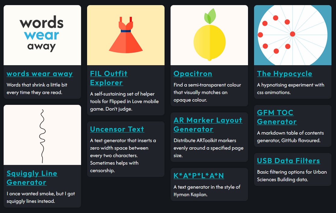
For a live example, my personal website falls back to a hacky flex layout if the browser doesn’t support masonry grids.
masonry-relevant.pngThe masonry grid in action
-
Google Images layout is an example of a horizontal masonry layout, while Pinterest is an example of a vertical one. ↩
-
A multi-column CSS layout, flows an element’s content into columns. ↩
-
The
column-gapproperty only applies to the space between columns, not between rows (as the name might suggest). The space between rows can be set usingmarginon the child elements. ↩ -
The algorithm is explained in more detail in the editor’s draft ↩
-
Enabled since version 163. See the release notes ↩
-
Available since version 77 and enabled by default in Nightly. Can be enabled from
about:configby settinglayout.css.grid-template-masonry-value.enabledtotrue. See the release notes ↩
Topics
Mentions
Fetching mentions...